Open ten different “Google dashboard” examples and you’ll notice something odd. Most of them are stuffed with charts, and almost none of them tell you what to actually do next. Forty widgets, six colors, three tabs — and a client who still has to email their account manager to ask, “so, is this good or bad?”
That’s the real problem with most dashboards, Google-built or otherwise. A chart isn’t the same thing as an answer. This guide covers what Google dashboards actually are, how they connect to Data Studio, and — because this is where most guides stop short — how agencies build dashboards people actually open, and how they automate the reporting built around them.
What Are Google Dashboards, Really?
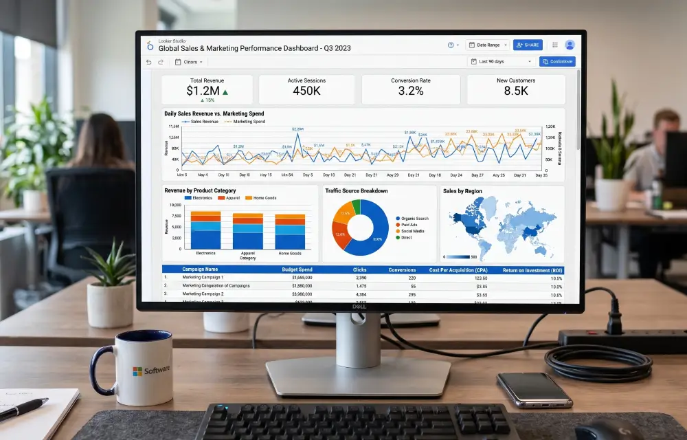
“Google dashboard” isn’t one specific product. It’s shorthand for a visual report — usually built in Data Studio — that pulls data from Google tools like GA4, Google Ads, and Search Console into charts, tables, and scorecards someone can scan in under a minute.
The dashboards themselves live in Data Studio (data studio.google.com), which connects natively to most Google products and, through partner connectors, to dozens of non-Google platforms too: Meta Ads, HubSpot, Shopify, and plenty more. Google Sheets often sits in the mix as a lightweight staging layer, holding data a native connector can’t reach directly. For larger data volumes, agencies sometimes route everything through Google Cloud’s BigQuery first, then connect Data Studio to that instead of the raw source — though for most agency reporting, that’s more infrastructure than the job needs.
A dashboard shows what’s happening. A report explains what happened. Analysis explains why. Strategy decides what comes next. Most agency dashboards only ever do the first job — which is exactly why a client can stare at one and still not know if things are going well.
Keep that four-part chain in mind. It explains why a technically accurate dashboard can still feel useless, and it’s the thread running through everything else in this guide.
What Can a Google Dashboard Actually Do?
The honest answer: whatever data you can connect to it. In practice, a handful of use cases cover most of what agencies and marketing teams actually build.
Website performance
Sessions, users, engagement, and traffic sources pulled straight from GA4, usually the first tab in any dashboard.
SEO tracking
Impressions, clicks, average position, and query-level data from Search Console, often paired with a rank tracker for keywords GSC doesn’t fully cover.
Google Ads performance
Spend, CPC, conversions, and ROAS by campaign — the dashboard most clients check first if they’re paying for traffic.
Lead generation
Form submissions, cost per lead, and lead source, often blended with CRM data to show which channels produce leads that actually close.
Ecommerce
Revenue, transactions, average order value, and product performance, usually tied to GA4’s ecommerce reporting.
Multi-channel campaign reporting
Paid, organic, email, and social pulled into one view — genuinely useful, genuinely easy to overbuild.
Client reporting
A branded, recurring view built specifically for someone outside the agency, with far less tolerance for clutter than an internal dashboard.
Executive reporting
A stripped-down summary for someone who wants three numbers and a trend line, not a full campaign breakdown.
Google Dashboards vs. Data Studio: Clearing Up a Genuinely Confusing Naming History
Here’s something worth getting straight, because the terminology has actually changed recently and a lot of content online is now out of date. Google’s free dashboarding tool launched in 2016 as Data Studio. In October 2022, Google renamed it Looker Studio, trying to unify it with Looker — the enterprise business intelligence platform Google had acquired in 2019 for roughly $2.6 billion.
That naming didn’t stick. On April 11, 2026, Google reversed course and renamed the product back to Data Studio, citing exactly the confusion you’d expect: a free, ad-hoc visualization tool and a governed enterprise BI platform sharing the same name made it hard for buyers to tell them apart. If you’ve seen both “Looker Studio” and “Data Studio” used interchangeably in recent articles, that’s why — the rename is recent enough that plenty of content hasn’t caught up.
| Product | What it actually is | Who it’s built for |
|---|---|---|
| Data Studio (formerly Looker Studio) | Free, browser-based dashboard and reporting tool with native connectors to Google products | Marketers, agencies, small-to-mid teams building visual reports |
| Data Studio Pro | Paid tier adding team management, access controls, and official support | Agencies and companies managing dashboards at scale |
| Looker | Enterprise BI platform built around LookML, a governed semantic modeling layer | Data teams needing large-scale, tightly governed analytics |
For nearly every agency reading this, Data Studio — the free tool, not the enterprise Looker platform — is what actually matters. When people search “Google dashboard,” this is almost always the tool they mean, whether they know its current name or not.
The Anatomy of a High-Quality Marketing Dashboard
Instead of dragging charts onto a blank canvas and hoping it comes together, it helps to think in layers. Each one answers a slightly different question, and skipping straight to layer four without building the first three is exactly how dashboards end up overwhelming instead of useful.
Executive summary
Three to five numbers and a one-line read on how the period went. This is the only section some readers will ever look at.
Traffic and acquisition
Where visitors came from and how that mix shifted — the context layer everything else builds on.
Conversion performance
What visitors actually did — leads, sales, sign-ups — and how that compares to the previous period.
Channel performance
A breakdown by channel or campaign for anyone who needs to go deeper than the summary layer.
Trends and anomalies
What moved unusually, and a short note on why — this is where a dashboard starts doing a report’s job.
Actions and next steps
What the team is actually doing about what the data shows. Often skipped, arguably the most important layer.
Notice that only the last layer touches strategy. The first five layers describe what’s happening and what happened — useful, but not the same as telling someone what to do about it.
Which Metrics Should Actually Appear on an Agency Dashboard?
There’s no universal metric list, and any guide that hands you one without asking about your client’s business is guessing. What belongs on a dashboard depends entirely on the business objective behind it.
| Metric | What it tells you | When it matters most |
|---|---|---|
| Users / Sessions | Reach and traffic volume | Early-stage brand or content campaigns |
| Conversions / Conversion rate | How well traffic turns into outcomes | Almost always, once goals are tracked properly |
| Leads / Cost per lead | Efficiency of lead generation spend | B2B and service businesses |
| CPC / CTR | Ad efficiency and message relevance | Any paid search or paid social campaign |
| ROAS | Revenue return on ad spend | Ecommerce and direct-response campaigns |
| Organic clicks / Impressions | Visibility and demand in search | SEO-focused engagements |
| Average position | Ranking trend for tracked queries | SEO, though it’s easy to overweight |
| Revenue | The business outcome everything else feeds into | Whenever tracking allows a reliable connection |
Don’t put every available metric on one screen just because the connector makes it easy. A dashboard with thirty metrics and a dashboard with six aren’t different by degree — they’re different products, built for different kinds of attention.
How to Build a Google Dashboard: A Practical Workflow
The tool itself is genuinely simple to use. Deciding what to build before you open it is where most of the actual work happens.
Define the audience
A CMO, a founder, and a paid media specialist need three different dashboards, not one dashboard with more tabs.
Define the business question
What decision is this dashboard supposed to support? Budget reallocation looks nothing like a monthly check-in.
Define the KPIs
Pick the handful of metrics that actually answer the question above — not everything the data sources happen to offer.
Identify the data sources
List exactly what feeds the dashboard: GA4, Ads, GSC, a CRM, a spreadsheet — before connecting anything.
Connect the data
Use native Google connectors where possible; reach for a third-party connector only for platforms Data Studio doesn’t support directly.
Structure the dashboard
Follow the layered framework above rather than arranging charts by whatever order you happened to build them.
Choose visualizations deliberately
A line chart for trends, a bar chart for comparisons, a scorecard for a single important number. Match the chart to the question, not the other way around.
Add filters and a comparison period
A number without something to compare against rarely means anything on its own.
Validate the numbers
Cross-check totals against the native platform (GA4, Ads Manager) before anyone else ever sees the dashboard.
Test permissions and share
Confirm the client sees exactly what they’re supposed to see — no more, no less — before sending the link.
Set a maintenance process
Someone needs to own checking connections and updating the dashboard as accounts, goals, or campaigns change.
How Agencies Should Design Client-Facing Dashboards Differently
An internal dashboard can afford some clutter — the people using it already understand the context. A client dashboard can’t. It needs to work for someone who checks it once a month and doesn’t have your account manager’s shorthand for what’s normal.
- Branding: logo, colors, and consistent formatting across every client, not a generic template with a logo pasted on top.
- Client-specific KPIs: built around that client’s actual goals, not a one-size-fits-all agency template.
- Consistent date ranges: every chart on the same period, so nothing quietly compares different timeframes.
- A real comparison period: month-over-month or year-over-year, chosen for what’s actually meaningful to that business.
- A short executive summary: written in plain language, not just a row of scorecards.
- Readable charts: fewer colors, clearer labels, no chart type chosen just because it looks more sophisticated.
- Annotations on unusual changes: a one-line note explaining a spike or dip, so the client isn’t left guessing.
- Performance kept separate from interpretation: let the data show what happened; use commentary, not chart placement, to explain why.
Get these right, and a dashboard graduates from “the thing the agency sends” to something the client actually opens between calls. That’s genuinely rare, and it’s a real differentiator worth designing for.
The Manual Client Reporting Problem
Before automation enters the picture, it helps to see exactly where manual reporting workflows lose time and accuracy. A typical monthly cycle, repeated for every client, looks roughly like this:
Each arrow in that chain is a manual handoff, and each handoff is a place where something can go wrong. A stale export. A copied value in the wrong cell. A chart still showing last month’s range because nobody remembered to update it. None of these mistakes require carelessness — they’re just what happens when the same repetitive sequence runs across a dozen clients, every single month.
The time cost compounds the same way. Twenty minutes for one client is trivial. Twenty minutes times fifteen clients, every month, is most of a working week spent on formatting instead of strategy.
Automating Client Reporting: What Actually Changes
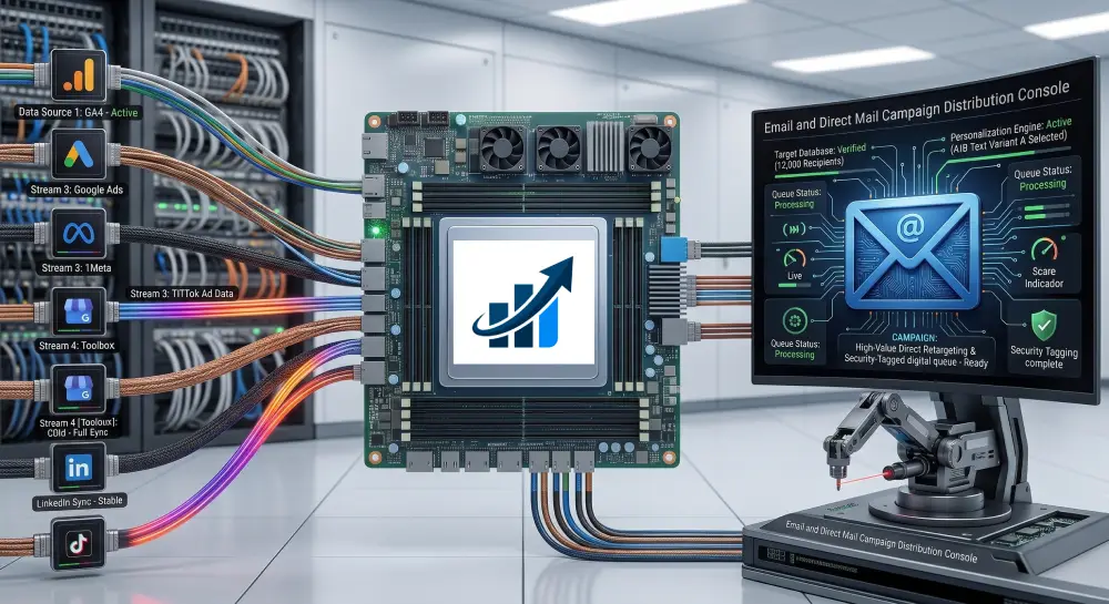
Automated reporting replaces that manual chain with a connected pipeline. The shape of it looks like this:
Instead of exporting CSVs by hand, connectors pull fresh data on a schedule. Instead of rebuilding formatting every month, the dashboard structure stays fixed and only the numbers change. Instead of manually emailing a PDF, delivery happens automatically, on whatever cadence the agency sets.
What doesn’t — and shouldn’t — get automated away is judgment. A system can flag that traffic dropped 18% week over week. It can’t tell you, with certainty, whether that’s a tracking issue, a seasonal dip, or a real problem worth escalating. That interpretation still needs a person, which is exactly the distinction between the “dashboard” layer and the “analysis” layer from earlier in this guide.
This is the layer where a dedicated agency reporting platform tends to go further than a manually maintained Data Studio file — not by replacing analysis, but by handling the connection, refresh, and delivery work so a person’s attention goes toward the parts that actually need it.
A Realistic Agency Example (Hypothetical)
The following is a hypothetical, illustrative example, not a real client case study. Numbers are assumed for illustration only.
Picture a nine-person agency managing eighteen clients across SEO and paid search. Before adopting any dashboard automation, here’s roughly what a reporting cycle involved, assuming about 25 minutes of manual work per client, per month.
- Each account manager exports GA4, GSC, and Ads data by hand
- Numbers get pasted into a client-specific spreadsheet
- Charts and formatting get rebuilt or adjusted monthly
- Reports get exported to PDF and emailed individually
- ~25 min/client × 18 clients ≈ 7.5 hours a month, assuming no errors
- Data sources connect once per client, not rebuilt monthly
- A standardized dashboard template pulls fresh data automatically
- Reports refresh and generate on a fixed schedule
- A team member spends a few minutes reviewing, not building
- Time shifts from formatting toward checking and interpreting numbers
The point of this hypothetical isn’t a precise number — every agency’s setup differs. It’s the shape of the change: manual hours move from data handling toward review and client communication, which is where an account manager’s time is actually worth something.
Common Google Dashboard Mistakes
Too many metrics
More charts rarely means more clarity. Usually it means the opposite.
Vanity metrics
Pageviews and impressions look impressive and rarely connect to a business outcome anyone’s tracking toward.
Unclear KPI definitions
“Conversions” means something different in GA4 than it does in Ads. Mixing definitions quietly breaks trust in the numbers.
No comparison period
A number with nothing to compare against tells a reader almost nothing about whether it’s good.
Misleading visualizations
Truncated axes and mismatched scales can make a flat trend look dramatic, intentionally or not.
Inconsistent date ranges
One chart on “last 30 days,” another on “this month” — small enough to miss, confusing enough to matter.
Broken filters
A filter that silently stops working can quietly change what a whole dashboard is actually showing.
Poor permissions
A client seeing another client’s data, or an internal tab, is a trust problem that’s entirely avoidable.
Mixing incompatible data
Blending sources with different attribution models can produce numbers that look precise and mean very little.
Ignoring attribution limitations
Every platform undercounts or overcounts something. Pretending otherwise sets up a hard conversation later.
No explanation for major changes
A big spike or drop with no annotation just invites the client to guess — usually wrong.
Building dashboards nobody uses
The most common failure of all. Impressive to build, ignored the moment it’s delivered.
Dashboard QA Checklist Before You Hit Send
- Data accuracy: totals match the native platform within an acceptable margin
- Date ranges: consistent across every chart on the page
- Filters: tested and returning the expected results
- Totals and math: sums and percentages actually check out
- Conversions: defined consistently across every connected data source
- Permissions: the client sees only what they should, nothing more
- Branding: logo, colors, and formatting consistent with the agency’s standard
- Readability: legible on a smaller screen, not just a full desktop monitor
- Links: every link and button actually goes where it should
- Data freshness: connections active, no silently stale data sources
- Client-specific metrics: the KPIs that matter to this client are actually present
When Google Dashboards Are Not the Right Solution
Worth being honest about this. Data Studio is genuinely strong for the majority of agency reporting needs, but it isn’t the right tool for everything.
- Complex BI requirements: once an organization needs governed semantic models and cross-team data definitions, a platform like Looker fits the job better than a free dashboarding tool.
- Large-scale data warehousing: genuinely large datasets usually need BigQuery or a similar warehouse underneath, with the dashboard as just the visual layer on top.
- Advanced transformation requirements: heavy data cleaning and modeling belongs upstream of the dashboard, not inside it.
- Strict governance requirements: regulated industries sometimes need access controls and audit trails beyond what a free tool offers.
- When a client needs narrative, not a live dashboard: some clients genuinely want a written explanation more than a screen to check — a dashboard doesn’t replace that.
None of this makes dashboards the wrong choice for most agencies. It just means “we’ll put it in a dashboard” isn’t automatically the right answer to every reporting problem.
Google Dashboards and Agency Growth
A standardized dashboard system pays off less in any single report and more in how it changes the agency’s operations over time.
- Faster client onboarding: a repeatable template means less time building each new client’s reporting from scratch.
- Standardized reporting: every account manager delivers a consistent structure instead of a personal spreadsheet style.
- Less repetitive work: time shifts away from formatting and toward strategy and client conversations.
- Better consistency: fewer surprises when a client compares this month’s report to last month’s.
- Improved client visibility: clients who can self-serve basic questions from a live dashboard ask fewer “what’s my traffic doing” emails.
- Easier scaling: adding client twenty is closer to adding client two once the underlying system is standardized.
None of this guarantees retention or growth on its own — a dashboard is infrastructure, not a strategy. But infrastructure that removes friction tends to make good strategy easier to execute consistently, which is really the best case for building this properly in the first place.
See how a connected agency dashboard actually works
RaiseReturn connects GA4, Google Ads, Meta Ads, Search Console, and PageSpeed into one standardized, branded reporting system — built specifically around the client reporting workflow this guide describes.
Explore RaiseReturn Features →The Final Framework: A Sequence You Can Apply Immediately
Define the audience and the question first, every time, before opening any tool. Connect the data sources that actually answer that question, nothing more. Structure the dashboard in layers, from summary down to detail. Validate the numbers against the source platform before anyone outside the agency sees them.
Automate the parts that are purely repetitive — data pulls, formatting, delivery. Interpret what the automated system can’t: why something changed and what it means for the client’s goals. Then improve the dashboard over time, because a client’s KPIs six months from now rarely look exactly like they do today.
A dashboard full of charts is easy to build. A dashboard someone actually opens, understands, and acts on takes a bit more discipline — but it’s the only version actually worth the time.
Frequently Asked Questions
Google dashboards were never going to save a reporting process by themselves. The tool has always been capable enough — Data Studio can connect, visualize, and refresh data just fine. What separates a dashboard clients actually use from one they quietly ignore is whether someone thought through the audience, the question, and the layer of interpretation before opening the canvas at all.